Two-Tone Kitchen Cabinets: Design Rules, Color Combinations, And Mistakes To Avoid
Imagine you’re flipping through a home design magazine, and every kitchen looks the same – all one color. It can feel a little dull, right?
That’s where the magic of Two-Tone Kitchen Cabinets: Design Rules, Color Combinations, and Mistakes to Avoid comes in.
This approach adds instant personality and depth to your cooking space. By understanding the simple rules and creative ideas presented here, you’ll feel confident picking the perfect shades.
You’ll learn how to make your kitchen pop, keeping visitors engaged longer and encouraging them to explore every corner of your design.
Key Takeaways
- You will learn how to select complementary color schemes for two-tone kitchen cabinets.
- Understand the basic design principles that make two-tone cabinets work visually.
- Discover popular color combinations that are trending and timeless.
- Learn common mistakes to avoid when implementing a two-tone cabinet design.
- Gain insights into where to place different colors for the best impact.
The Appeal of Two-Tone Kitchen Cabinets
Two-tone kitchen cabinets offer a refreshing departure from the monotony of a single-color scheme. They bring a dynamic visual interest that can transform a kitchen from ordinary to extraordinary.
This design choice allows for a high degree of personalization, letting homeowners express their unique style. It’s a way to add depth, texture, and a touch of sophistication to the heart of the home.
Adding Depth and Dimension
Using two different colors for your cabinets creates a layered effect. This visual depth makes the kitchen feel larger and more inviting.
It breaks up large expanses of cabinetry, preventing the space from feeling overwhelming. Think of it like an artist using different shades to create a painting; the interplay of colors adds richness.
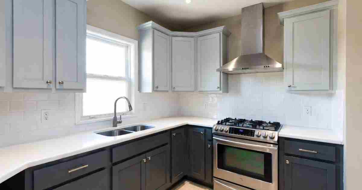
The strategic placement of colors is key. Often, a darker color is used on the lower cabinets, providing a grounding effect. This makes the kitchen feel more stable and robust.
Lighter colors are then used on the upper cabinets, creating a sense of airiness and openness.
Expressing Personal Style
Two-tone cabinets are a fantastic way to inject personality into your kitchen. Whether you prefer bold and dramatic or subtle and sophisticated, there’s a combination that fits. You can match your cabinets to your home’s overall aesthetic or use them as a statement piece.
For example, a farmhouse-style kitchen might pair creamy white uppers with a soft gray or muted blue lower cabinets.
A modern kitchen could opt for sleek black uppers with crisp white lowers. The possibilities are virtually endless, allowing you to curate a space that truly feels like yours.
Creating a Focal Point
A well-executed two-tone cabinet design can serve as a striking focal point in the kitchen. This can draw the eye and create a memorable impression. It’s a way to highlight architectural features or a specific design element you want to showcase.
Consider using a more vibrant or contrasting color on a specific section, like an island or a pantry wall. This strategically placed color can become the star of the show, guiding the visual flow of the room. It’s an effective design trick that adds excitement without overwhelming the space.
Design Rules for Two-Tone Kitchen Cabinets
Getting the two-tone look right involves more than just picking two favorite colors. Certain design principles ensure the result is harmonious and aesthetically pleasing. These rules help create balance and prevent the kitchen from looking chaotic or unbalanced.
The 60-30-10 Rule (Adapted)
While the 60-30-10 rule is common in interior design for wall colors, it can be adapted for cabinets. Think of the dominant color as your main cabinet shade, covering about 60% of the visual space.
Your secondary color will be about 30%, and a smaller accent color (perhaps for hardware or a backsplash) will be 10%.
In a two-tone cabinet scenario, this often translates to one color being more prevalent than the other. For example, if you have a large kitchen, you might have more of one color than the other to maintain balance. This ensures that one color doesn’t overpower the entire design.
It creates a pleasing visual hierarchy.
Consider Cabinet Placement
Where you place each color is critical for balance and visual weight. The most common approach is to use a darker color on the base cabinets and a lighter color on the wall cabinets. This grounds the kitchen and makes it feel more stable.
Lower cabinets bear more visual weight due to their size and proximity to the floor. Darker colors absorb light and appear heavier, making them ideal for this position. Upper cabinets, being closer to the ceiling, benefit from lighter colors that reflect light and create an airy feel.
This contrast helps define the kitchen’s architecture.
Balance and Contrast
The key to successful two-tone cabinets is finding the right balance between your chosen colors. You want enough contrast to be interesting but not so much that it feels jarring. The colors should complement each other rather than compete.
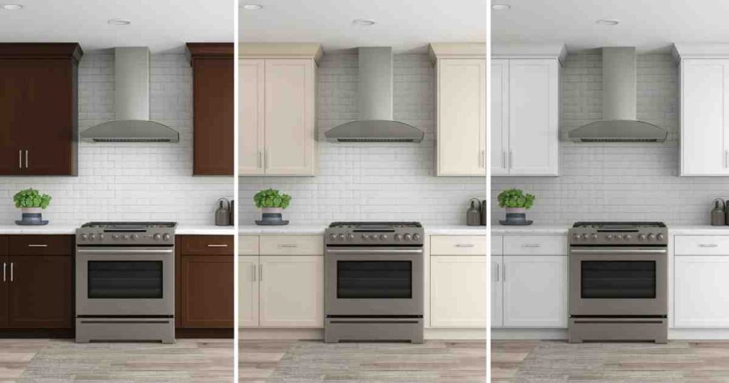
Think about the intensity and undertones of each color. A bold, saturated color paired with a neutral will create a strong statement. Softer, more muted tones will create a more subtle and relaxed atmosphere.
Understanding color theory, even at a basic level, will greatly aid your choices.
Hardware and Finishes
Don’t forget about the hardware! Your cabinet knobs, pulls, and hinges are the jewelry of your kitchen. They can either enhance or detract from your two-tone design. Choose hardware that complements both cabinet colors.
For a classic look, brushed nickel or matte black hardware often works well with many two-tone combinations. For a more modern or luxurious feel, consider gold or brass finishes. The finish of your hardware can tie the entire look together, adding a polished final touch.
Popular Color Combinations for Two-Tone Kitchen Cabinets
The world of two-tone kitchen cabinets is bursting with exciting color combinations. These pairings can range from subtle and sophisticated to bold and vibrant. Choosing the right combination is often the most fun part of the design process.
Classic Whites and Grays
This is a timeless pairing that remains incredibly popular for a reason. It offers a clean, bright, and sophisticated look that suits almost any kitchen style, from modern to transitional.
Imagine soft, creamy white upper cabinets paired with charcoal gray lower cabinets. This combination provides excellent contrast without being overwhelming. It’s a safe yet stylish choice that often appeals to a broad audience.
The neutral tones make it easy to accessorize with colorful backsplashes or vibrant decor.
Navy and White
A navy and white kitchen offers a nautical, coastal, or classic feel. Navy is a rich, deep color that can act as a strong accent or a primary base. White keeps the space feeling light and airy.
Pairing navy base cabinets with crisp white upper cabinets creates a strong, welcoming look. This combination feels classic and can be dressed up with brass hardware for a touch of elegance or kept simple with silver. It’s a versatile choice that adds a touch of drama.
Black and Wood Tones
For a more modern and sophisticated vibe, consider black paired with natural wood tones. This combination adds warmth and texture to the kitchen. It feels contemporary and chic.
Black upper cabinets can create a dramatic effect, especially when paired with lighter wood lower cabinets.
Alternatively, dark wood lowers can anchor a kitchen, with black uppers adding a sleek, modern edge. This pairing often works well in kitchens with open shelving, allowing the wood grain to shine.
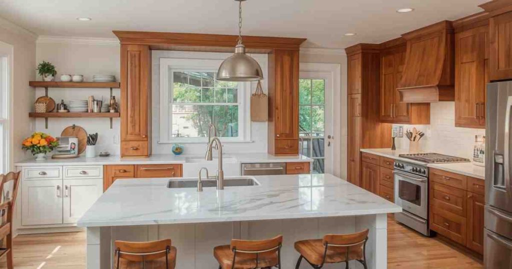
Two Shades of Wood
Using two different wood stains can create a nuanced and organic look. This approach adds warmth and character without relying on paint colors. It’s a sophisticated choice for those who love natural materials.
For instance, pairing a light maple on the upper cabinets with a darker walnut on the lower cabinets provides subtle contrast.
The different wood grains and colors create visual interest and a sense of depth. This combination feels very grounded and can suit a variety of styles, from modern to rustic.
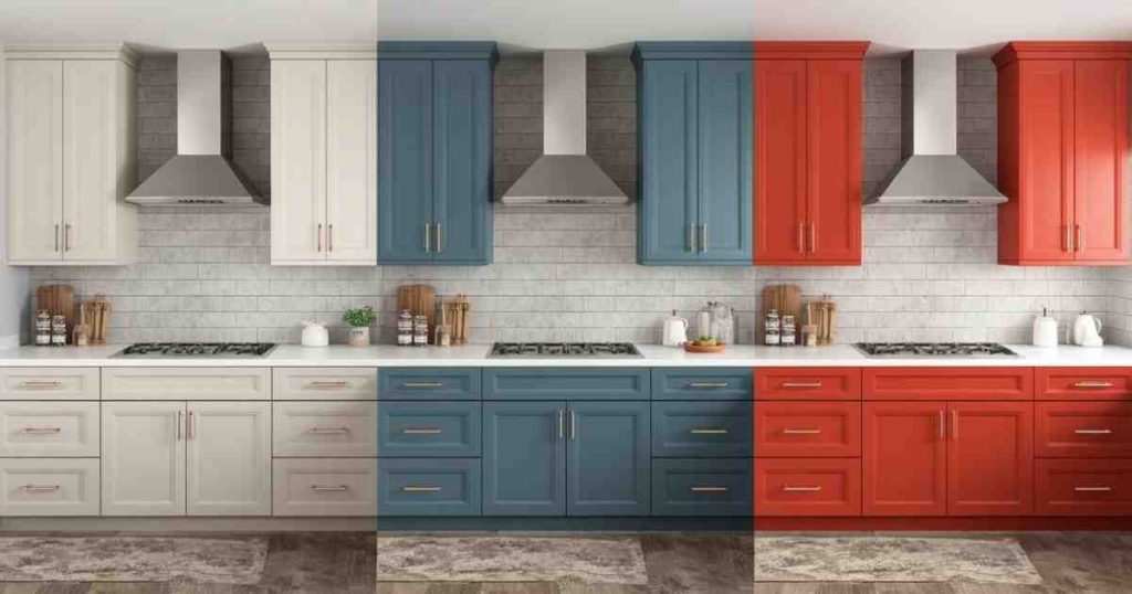
Bold Colors with Neutrals
Don’t shy away from bold colors if that’s your style! Pairing a vibrant color with a neutral like white, gray, or even black can create a stunning focal point.
Imagine a bright teal or a rich emerald green on the island cabinets, with classic white cabinets on the perimeter.
This creates an immediate wow factor. The neutral colors balance the boldness of the accent color, ensuring the kitchen remains inviting and functional.
Mistakes to Avoid with Two-Tone Kitchen Cabinets
While the possibilities are exciting, there are a few common pitfalls to sidestep when designing with two-tone cabinets. Avoiding these mistakes will ensure your kitchen looks polished and intentional, rather than haphazard.
Using Too Many Colors
The definition of “two-tone” implies just two primary colors for the cabinets. Adding a third color for the cabinets, or relying heavily on multiple contrasting colors in other elements like the backsplash and countertops, can quickly lead to a cluttered and chaotic look.
Stick to your two chosen cabinet colors and let other elements provide subtle accents. For instance, if you have navy and white cabinets, choose a backsplash that complements those colors rather than introducing a third, competing hue. A backsplash with subtle hints of navy or white in its pattern can be perfect.
Poor Color Placement
As mentioned earlier, placement matters. Putting a dark, heavy color on the upper cabinets and a light, airy color on the lower cabinets can make the kitchen feel top-heavy and unstable. This visual imbalance can be quite unsettling.
Always consider the visual weight of colors. Darker colors recede and feel heavier, making them suitable for lower cabinets. Lighter colors advance and feel lighter, making them ideal for upper cabinets to create a sense of openness.
Ensure the balance feels right for the room’s proportions.
Ignoring Hardware and Finishes
The wrong hardware can clash with your cabinet colors and ruin the overall aesthetic. Using hardware that is too ornate with sleek, modern cabinets, or too simple with traditional ones, will create a disconnect.
Coordinate your hardware finish with your chosen color scheme. For example, a modern kitchen with black and white cabinets might look great with matte black or brushed nickel pulls.
A more traditional kitchen with white and gray cabinets could benefit from polished chrome or even brushed brass.
Consistency is key here.
Not Testing Samples
Colors can look very different on a screen or a small paint chip compared to how they appear on large cabinet doors in your actual kitchen lighting. Always test paint samples in your space before committing.
Paint a large swatch of each color on a piece of wood or cardboard, or even directly on an inconspicuous part of your existing cabinets if you’re repainting.
Observe them at different times of day and under both natural and artificial light. This step is crucial for avoiding costly mistakes and ensuring you love the final look.
Real-Life Examples and Scenarios
Seeing how two-tone cabinets work in practice can offer valuable inspiration. These examples illustrate how the principles discussed can be applied to create beautiful and functional kitchens.
Example 1: The Modern Farmhouse Kitchen
A family wanted to update their dated kitchen, aiming for a look that was both modern and inviting. They chose a combination of creamy white for the upper cabinets and a soft, muted sage green for the base cabinets and the island.
This choice created a bright and airy feel while the sage green added a touch of color and warmth. They paired this with brushed gold hardware, which beautifully complemented both the white and the green.
The result was a kitchen that felt fresh, charming, and highly functional, with the green island serving as a subtle focal point.
The contrast was appealing without being overpowering.
Example 2: The Sleek Urban Kitchen
A young professional couple living in a city apartment wanted a kitchen that reflected their contemporary style. They opted for a bold contrast: high-gloss black upper cabinets and rich, dark walnut lower cabinets.
This combination created a dramatic and sophisticated look, fitting perfectly with their urban loft aesthetic.
The high-gloss finish on the black cabinets reflected light, preventing the dark color from making the space feel too heavy. They complemented this with minimalist stainless steel hardware.
The kitchen felt chic, modern, and visually striking.
Scenario: Updating Your Existing Cabinets
Let’s say you have a kitchen with all-white cabinets and you’re looking to add some dimension.
- Assess your current kitchen layout: Note the size of your upper cabinets versus your lower cabinets. Which ones are most visible?
- Choose your colors: Decide on a primary color (often a neutral like white or gray) and a secondary color (perhaps a deeper tone like navy, green, or a wood stain).
- Plan the placement: For a safe and classic look, paint the lower cabinets your secondary color and leave the upper cabinets white. Or, if you have an island, consider painting just the island in your secondary color for a focal point.
- Prepare and paint: Thoroughly clean, sand, and prime your cabinets. Then, apply your chosen paint colors. For a professional finish, consider using a sprayer.
- Add new hardware: Select hardware that complements both colors.
This process can significantly update your kitchen’s look without the cost of full cabinet replacement.
Statistical Insights on Kitchen Design Trends
Kitchen design is a dynamic field, and color trends play a significant role. Understanding what is popular can help inform your own design choices.
Cabinet Color Preferences
According to a recent Houzz survey, white remains the most popular cabinet color for kitchens, chosen by 48% of homeowners.
However, there is a growing interest in darker tones and two-tone designs. Approximately 10% of homeowners are opting for two-tone cabinets, with preferences for contrasting colors.
This statistic highlights that while white is a classic, the desire for more personalized and dynamic kitchens is on the rise.
The 10% figure for two-tone cabinets represents a significant segment, showing it’s a well-established trend, not just a fleeting fad.
The Impact of Color on Resale Value
While personal preference is paramount, neutral colors generally perform best for resale value. However, a well-executed two-tone design, especially with sophisticated pairings like navy and white or black and wood, can actually increase a home’s appeal.
A study by Zillow found that kitchens with navy blue cabinets, for instance, could increase a home’s sale price by an average of $5,000. This suggests that strategic use of color, including two-tone designs, can be a smart investment.
Common Mistakes and How to Fix Them
Even with careful planning, sometimes a design doesn’t quite hit the mark. Here’s how to address common issues with two-tone cabinets.
The Kitchen Feels Too Dark
If your chosen dark color is overwhelming the space, it might be too much, or the lighting isn’t adequate.
Fix: Lighten up. Consider repainting some of the darker cabinets with a lighter shade. Alternatively, increase the kitchen’s lighting with more task lights, brighter bulbs, or a more decorative overhead fixture.
Adding reflective surfaces like a polished backsplash can also help bounce light around.
The Colors Don’t Quite Match
Sometimes, the colors you picked look good separately but clash when put together. This can happen due to undertones or simply a poor color pairing.
Fix: Re-evaluate. If the colors are truly clashing, the most effective solution is to repaint one set of cabinets. Choose colors that have similar undertones or a clear, intentional contrast.
For example, if you have a warm gray that clashes with a cool white, consider repainting the gray with a cooler gray or the white with a warmer cream.
Hardware Looks Out of Place
You might have chosen the perfect cabinet colors, but the hardware feels off. It could be too trendy, too traditional, or the wrong finish.
Fix: Swap it out. Hardware is one of the easiest elements to change. Experiment with different finishes and styles until you find something that harmonizes with both cabinet colors and the overall kitchen style.
For instance, if matte black feels too stark, try a brushed nickel or a satin brass.
Frequently Asked Questions Of Two-Tone Kitchen Cabinets: Design Rules, Color Combinations, And Mistakes To Avoid
Question: Can I mix three colors in my kitchen cabinets?
Answer: While it’s possible, it’s generally not recommended for a cohesive two-tone look. Sticking to two main cabinet colors creates a cleaner, more intentional design. You can introduce a third color through accents like decor or a backsplash, but for the cabinets themselves, two is usually best.
Question: What is the best placement for dark cabinets?
Answer: Dark cabinets are best placed on the lower cabinets. This provides a grounding effect and makes the kitchen feel more stable. They absorb light and appear visually heavier, so putting them lower anchors the space effectively.
Question: Do I need to use professional painters for two-tone cabinets?
Answer: While you can DIY, professional painters can achieve a smoother, more consistent finish, especially with spray application. If you’re looking for a very high-end, flawless result, hiring a pro is a good idea.
Question: How do I choose hardware for two-tone cabinets?
Answer: Consider the overall style of your kitchen and the colors of your cabinets. Metals like brushed nickel, matte black, brass, or chrome often work well. It’s best to choose a finish that complements both cabinet colors and doesn’t compete.
Question: Can I use two-tone cabinets in a small kitchen?
Answer: Yes! In a small kitchen, use this technique strategically. A common approach is to use a light color for most cabinets and a slightly darker or contrasting color on an island or a single bank of cabinets to add interest without making the space feel cramped.
Wrap Up
Two-tone kitchen cabinets offer a fantastic way to add personality and style to your home. By carefully selecting your colors, considering placement, and avoiding common mistakes, you can create a kitchen that is both beautiful and functional. Embrace the design rules and color combinations to make your cooking space truly shine.

![What Materials Are Used In Modern Kitchens A Complete Material Guide[1]](https://kitchentoolslab.com/wp-content/uploads/2026/05/What_Materials_Are_Used_In_Modern_Kitchens__A_Complete_Material_Guide1-768x403.jpg)
![Modern Kitchen Vs Traditional Kitchen Which Design Suits Your Home Better[1]](https://kitchentoolslab.com/wp-content/uploads/2026/05/Modern_Kitchen_Vs_Traditional_Kitchen__Which_Design_Suits_Your_Home_Better1-768x403.jpg)
![How To Add Warmth To A Modern Kitchen Without Losing The Minimalist Feel[1]](https://kitchentoolslab.com/wp-content/uploads/2026/05/How_To_Add_Warmth_To_A_Modern_Kitchen_Without_Losing_The_Minimalist_Feel1-768x403.jpg)
![What Is A Scullery Kitchen The Hidden Prep Room Making A Comeback[1]](https://kitchentoolslab.com/wp-content/uploads/2026/05/What_Is_A_Scullery_Kitchen__The_Hidden_Prep_Room_Making_A_Comeback1-768x403.jpg)
![Japandi Kitchen Design How To Blend Japanese And Scandinavian Styles[1]](https://kitchentoolslab.com/wp-content/uploads/2026/05/Japandi_Kitchen_Design__How_To_Blend_Japanese_And_Scandinavian_Styles1-768x403.jpg)